How to Decorate with Different Shades of Red Moroccan Rugs
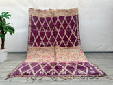
Cherry Gaggle Here, Purple There
Cherry accents and auburn touches are making red tones a leading decor trend, blending classic charm with a contemporary edge. Red, one of the oldest natural pigments, has been used as early as 3000 BC to color ocher ceramics. This color carries deep historical and cultural resonance, particularly in Morocco, where it appears vibrantly in textiles, especially in Moroccan rugs, enhancing spaces with warmth and boldness.
The Significance of Red in Moroccan Carpets
In Morocco, red symbolizes love, courage, and strength—three essential values in Moroccan tradition. This vibrant color is seen across Marrakech architecture, woven into everyday life in bustling markets, and underfoot in rugs made with red ocher dust from the desert. These red rugs are more than just decor; they are cultural expressions, bringing centuries-old artistry into modern interiors.
With so much red around, you might wonder where it fits best in your own home.
Red invigorates any room, and its associations have expanded to suit various design styles. In interior decor, red can range from bold and vibrant to deep and grounding tones that add warmth without overpowering a space. In minimalist or maximalist settings, red Moroccan rugs make stunning focal points, offering a grounded elegance to complement other furnishings.
Subtle Red Details to Get You Started
Red is a strong color, so balance is key when incorporating it into home decor. Start with modest touches—a Moroccan rug, a throw pillow, or a cozy textile—instead of painting entire walls. This lets you enjoy red's vibrancy without overwhelming the room.
Modern Minimalist: Red Accents with Neutrals
Use red sparingly to create a mid-century minimalist feel. A Moroccan rug with muted red tones pairs beautifully with mid-century furniture, anchoring the space without interrupting the clean lines typical of this style. This allows red to be understated yet impactful.
Near Neutrals: Harvest Tints Like Mahogany and Cottage Red
Colors like mahogany and cottage red evoke a cozy, autumnal warmth, balancing softness with a hint of depth. Paired with soft grays and muted pinks, these tones allow red to shine without dominating.
Old Stone to Modern: Southwestern Red
For a boho-inspired feel, terracotta and rust reds offer softer warmth. These shades pair naturally with wood and stone, creating a grounded, earthy aesthetic.
Warm and Rich Burgundy and Maroon
Deep reds like burgundy and maroon add richness and depth. Paired with earthy tones, these shades provide a fireside warmth that balances the space with a consistent red undertone.
Exploring tasteful ways to incorporate red and deeper shades into your decor can infuse a new, vivacious energy into your home, making it both elegant and culturally rich. Whether with a standout Moroccan rug or subtle burgundy accents, red adapts to any design preference, delivering a look that’s both unique and timeless.
Featured Products
169 x 251 cm = 5.5 x 8.2 ft moroccan wool rug, moroccan style rug, bohemian rug, handmade rug, outdoor patio, beniourain Rug, decor rug, Handmade Gift
- $599.00
$1,830.00- $599.00
- (-67%)
- Unit price
- / per
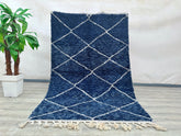
155 x 247 cm = 5.1 x 8.1 ft Diamonds Blue Soft Dots Berber Runner Rug - Handmade Moroccan Wool, Minimalist Design, Vintage Style, Perfect for Weddings & Bohemian Decor
- $599.00
$1,830.00- $599.00
- (-67%)
- Unit price
- / per
- Authentic Moroccan rug
- Beni Ourain rug
- Beniouraincarpets
- Berber rug
- bohemian rug moroccan rug
- Custom Area Rug
- Custom Moroccan Rugs
- Handmade rug imperfections
- Luxury home decor
- Modern Beni rugs
- Moroccan heritage
- Moroccan home décor
- Moroccan rug
- Moroccan rug authenticity
- Neutral hue rugs
- Plush area rug
- Plush texture rugs
- Rug interior alignment
- soft moroccan rug
- Traditional rug design
- Vintage Moroccan Rug
- white beni ourain
- White wool rug
